The problem
IGRC Square sells governance, risk and compliance work to organisations that are nervous by default. Their old presence didn’t explain what they did, and it gave a cautious buyer nothing to hold on to.
The question I worked from was simple. How does a visitor go from “who are these people” to “I’d trust them with our security” without reading a white paper?
What I did
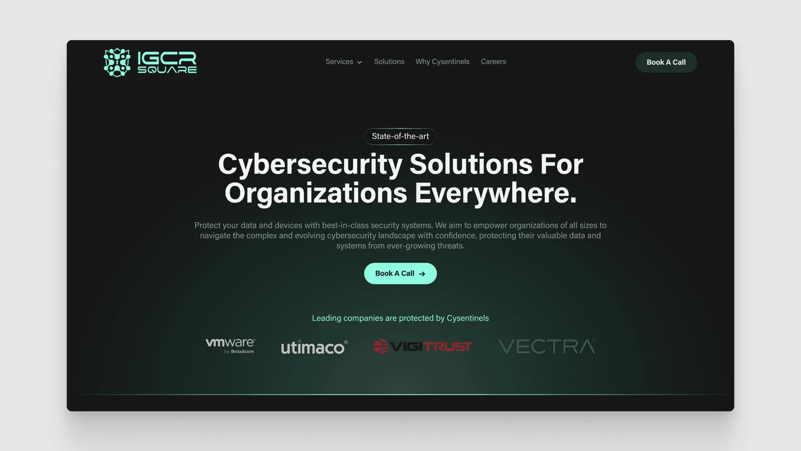
I worked directly with their leadership and designed and built the full responsive site in Framer.
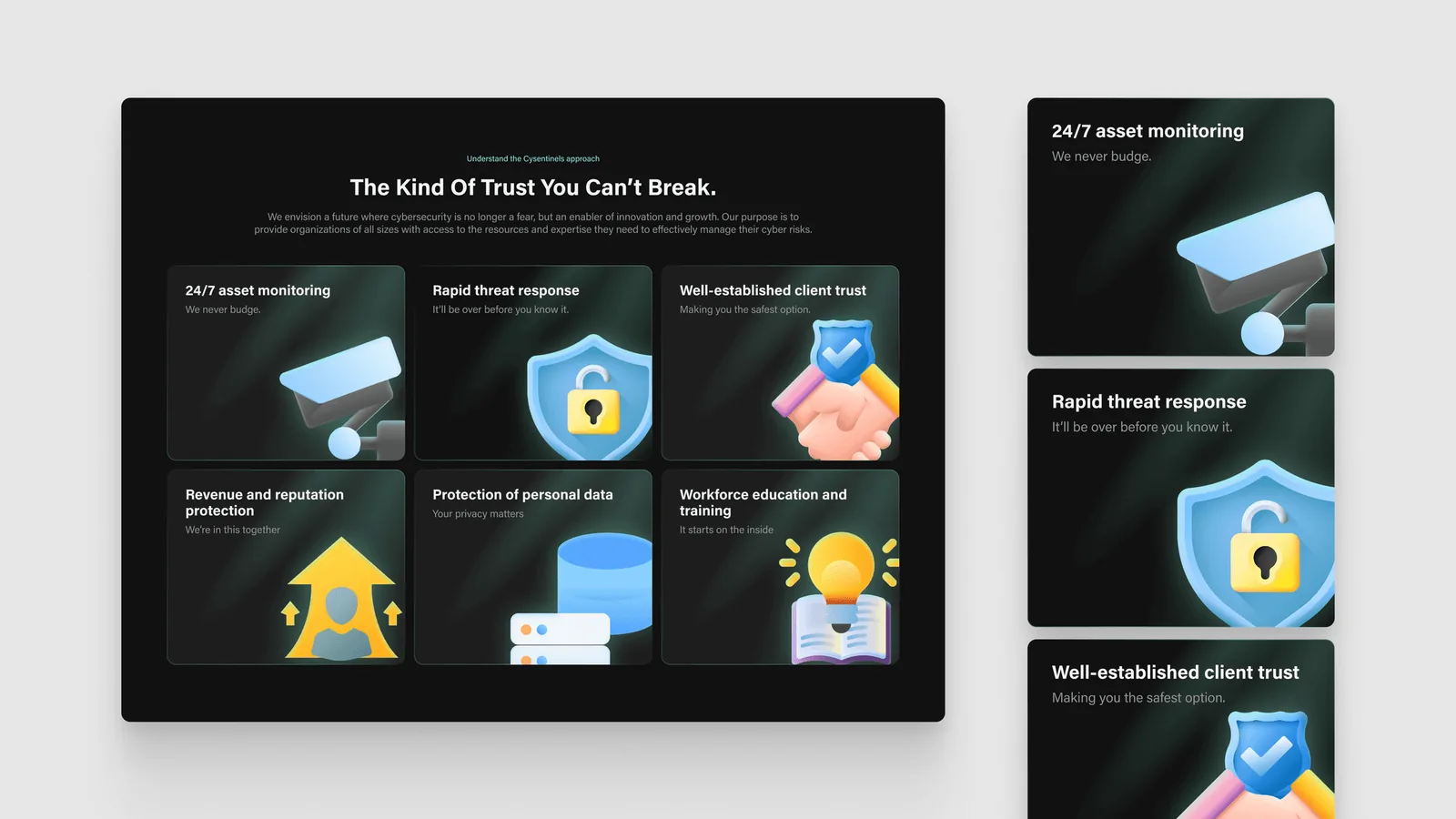
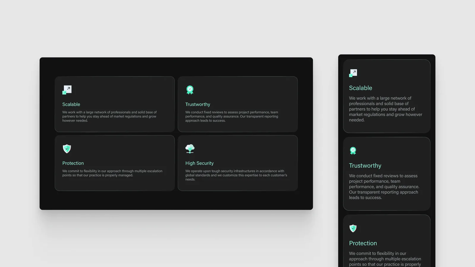
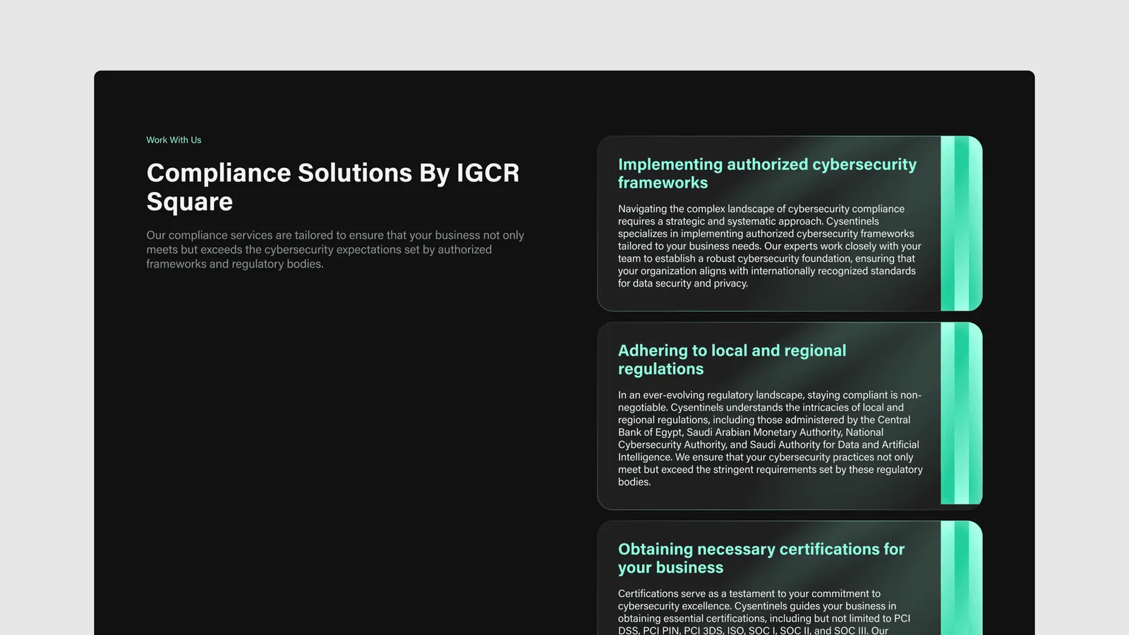
- Services, stated plainly. Governance, risk management and compliance each get a clear block, in the words a buyer uses.
- Proof early. Client logos and quotes sit near the top, where the doubt starts.
- One way in. A short contact form, so an inquiry doesn’t feel like a procurement process.
- Every screen size. The layout holds on a phone, because a lot of first visits happen there.
What changed
The team reported more inbound inquiries after launch, and a brand that finally matched the seriousness of the work. Because it’s built in Framer, their own team updates the content without waiting on a developer.
[Confirm: any number for inquiries before and after.]
What I’d keep
Put the proof where the doubt is. For a security firm, that’s the first screen.